Using the fav.ing brand
For partners, affiliates, publishers embedding a list, and anyone writing about us. The short version: use the logo as supplied, in the brand pink or in solid black or white, and don’t redraw it.
You do not need written permission to use the fav.ing name or logo to refer to fav.ing — in an article, a comparison, a review, or to link to a list. You do need to follow the rules on this page, and you may not use the mark in a way that implies fav.ing endorses or sponsors you when it doesn’t.
The logo
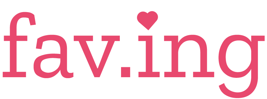
Two marks. The wordmark is the default — use it wherever there is room. The icon is for square contexts only: avatars, app tiles, favicons.

Clear space and minimum size
Leave clear space around the logo equal to the height of the f in “fav.ing” on every side. Nothing — text, imagery, borders, other logos — goes inside it.
Minimum size is 80px wide on screen, or 20mm in print. Below that the dot in “fav.ing” stops reading and it just looks like a smudge.
Correct and incorrect usage
The first three are fine. Everything after them is the real logo rendered wrong on purpose — these are the mistakes we actually see.
Also: don’t redraw or re-letter the wordmark, don’t use it as a letter inside another word, don’t animate it, and don’t combine it with your own logo into a single lockup. If you need a lockup, ask.
Color
One brand color. The other three are supporting values — don’t use them as the brand color.
fav.ing pink
#E8496E · rgb(232, 73, 110)
The brand color. Logo, links, primary buttons, list titles.
Pink light
#EC6A89 · rgb(236, 106, 137)
Hover states and lighter accents only.
Pink dark
#D13A5D · rgb(209, 58, 93)
Pressed states and shadow edges only.
Muted gray
#71717A · rgb(113, 113, 122)
Secondary text and inactive icons.
Typography
fav.ing uses Open Sans everywhere, on web and in both mobile apps. It’s free on Google Fonts. If you’re writing about fav.ing you should use your own typeface, not ours — this is here so partner materials that need to match can.
Writing the name
- It is fav.ing — lowercase, with the dot. Not Fav.ing, not FAV.ING, not Faving, not faving.
- Lowercase even at the start of a sentence. If that reads badly, rewrite the sentence.
- The company is Faving, Inc. — that one is capitalized, and it’s only for legal or financial contexts.
- People who use fav.ing are Favers. To fave something is to add it to a list.
- Don’t translate the name or add a possessive to the logo itself.
Linking and embedding
Link to any public list or profile freely. Lists can be embedded on your own site the way you’d embed a tweet — copy the embed code from any list’s share menu. Embedded lists carry their own fav.ing branding, so you don’t need to add the logo alongside one.
If you’re an affiliate or brand partner and you need a badge, a lockup, or sign-off on a campaign, email partnerships@fav.ing.
Questions
Brand and partnership questions: partnerships@fav.ing. Writing a story? The press kit has boilerplate, bios, and a founder photo. When in doubt, ask — we answer quickly and we’d rather say yes than find out afterwards.